
Uniqlo Website Information Architecture Redesign
Client Overview
Uniqlo, founded in Yamaguchi, Japan, in 1949, has grown into a globally recognized brand with over 1,000 stores worldwide. Guided by its mission, "Unlocking the Power of Clothing," Uniqlo focuses on sustainability and high-quality, long-lasting materials. While physical retail remains a primary revenue driver, Uniqlo’s e-commerce presence has seen significant growth, with online sales increasing by 30.3% year over year, raising e-commerce’s share of total revenue from 7.5% to 9.9% in early 2019.
Understanding Uniqlo’s Digital Experience
Information Environment
Uniqlo’s website incorporates common e-commerce functionalities, such as a search bar for direct item retrieval and an expandable navigation bar for product exploration. However, my analysis revealed usability issues that hinder the overall experience, impacting navigation efficiency and product discoverability.
User Research & Insights
To better understand user behaviors and pain points, I conducted 10 interviews with individuals of varying familiarity with Uniqlo. My findings highlighted three primary user types:
Uniqlo Insiders: Enthusiastic followers who stay updated on brand collaborations and product releases but may not purchase frequently.
Uniqlo Fans: Occasional shoppers who visit the site mainly during sales but rely on past shopping experiences to guide their navigation.
Uniqlo Newbies: Users who know the brand but have minimal interaction, often accompanying others to physical stores. They expect an intuitive browsing experience similar to other fashion e-commerce sites.
Evaluating Uniqlo’s Current Information Architecture
Strengths
Thorough Navigation & Recommendations: Users familiar with the site structure can efficiently locate specific products using the navigation bar and related product suggestions.
Effective Cross-Referencing: Uniqlo’s recommendation system allows for quick transitions between similar products, reducing browsing time.
Weaknesses
The research identified key usability challenges that impact discoverability and ease of navigation:
Disorganized Navigation: Inconsistencies in categorization (e.g., alphabetical sorting vs. thematic grouping) create confusion. While the current site follows a Z-Pattern, which places items according to the direction of human sight, the sheer amount of information is overwhelming. This pattern, may not be the most suitable for the type of content that Uniqlo is presenting.
Redundant Information: Duplicate menu items, such as "New Arrivals" and "New," add unnecessary complexity.

Unreliable Search Function: Keyword searches often yield inaccurate or unrelated results, forcing users to work harder to find desired products. As shown in the screenshots beside, searching for the keyword "sweatshirt" results in a top result of both woman's outerwear and sweatpants. The search bar is clearly not as accurate as it should be, making users work more than they need to in order to find the item they are seeking.

Recommendations for Improved Usability
1. Restructuring the Organization System
My recommendations focus on four main issues identified during our audit: disorganization, redundancies, inconsistencies, and unreliable components. To enhance the user experience, I prioritized cohesiveness, predictability, and intuitive task flows that streamline navigation.
A clearer hierarchy was essential to allow users to quickly scan a given section and correctly navigate to their desired destination. By adopting a hybrid categorization scheme, I ensured that main categories (e.g., Tops, Bottoms, Accessories) are topically grouped, while subcategories are arranged alphabetically for easier scannability. This structured approach improves ease of understanding while also enhancing ease of use, making the website more intuitive for both returning and new users.

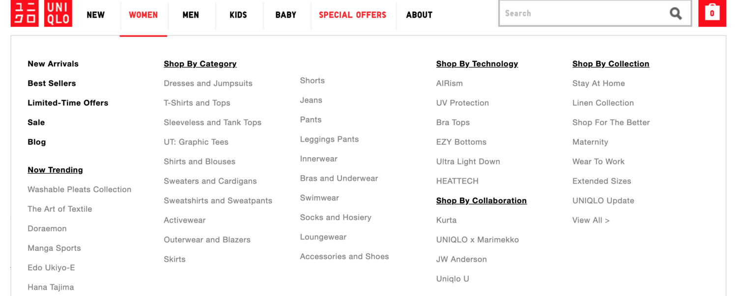
Current Organization System
Uniqlo’s existing top-level drop-down menu items (e.g., Now Trending, Shop by Category) are overly broad, making it difficult for users to navigate efficiently. The lack of clear distinctions between categories leads to confusion and extra cognitive load when searching for specific products.
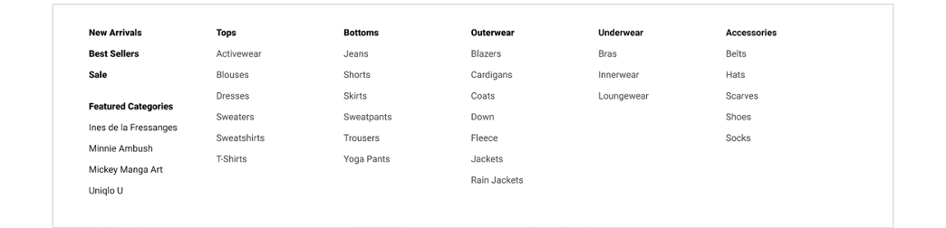
Proposed Organization System
To enhance usability, I implemented a hybrid categorization scheme. Main categories, such as Tops, Bottoms, and Accessories, are logically grouped, while subcategories are alphabetized for better scannability and easier discovery. The task analysis revealed that the current ordering based on perceived importance made subcategories harder to navigate. For instance, users often clicked on "Outerwear & Blazers" when searching for workwear, only to realize it didn't include work shirts. By switching to an alphabetical structure, I aim to improve searchability and provide a more seamless browsing experience.
2. Refining the Labeling System
To better highlight Uniqlo’s unique collections, I recommend elevating their visibility by replacing the vague "Trend Report" tab with a more focused "Collections" category. This category would consolidate various collections, such as collaborations, branded technologies (like Heattech), and seasonal offerings, under one roof. Additionally, trending items would be relocated to the appropriate Men’s, Women’s, and Kids’ categories, improving discoverability and making it easier for users to find relevant products based on their specific interests.
Current Labeling System
During the audit of the website, I identified that collections are a key differentiator for Uniqlo. These collections consist of curated groups of clothing, collaborations, or proprietary technologies (e.g., Heattech). However, the placement of these collections is inconsistent across the site, often tucked away within the "Trend Report" tab. This disjointed placement can be confusing for users, as understanding the full scope of Uniqlo's collections requires insider knowledge of the brand.

Proposed Labeling System
To better emphasize the importance of collections in Uniqlo’s branding, I propose replacing the unclear "Trend Report" tab with a dedicated "Collections" category in the top navigation. This new category will centralize Collaborations, Technologies (e.g., Heattech), and Clothing Collections, making it easier for users to understand what "Collections" encompass. Additionally, trending items will be relocated to their respective Women’s, Men’s, and Kids’ sections, ensuring a more intuitive and seamless browsing experience while reducing confusion in navigation.

3. Optimizing the Sitemap & Navigation Flow
To optimize Uniqlo’s sitemap and navigation flow, I propose introducing a dedicated "Collections" menu tab to streamline access to special product lines. This new tab will house "Collaborations" and "Technologies," providing a clearer entry point into Uniqlo’s unique fabric innovations and partnerships. Additionally, I am simplifying dropdown menus by grouping clothing into broader categories—Tops, Bottoms, Outerwear, Underwear, and Accessories—while organizing subcategories alphabetically for improved readability. This restructuring ensures that users, regardless of their familiarity with the site, can efficiently navigate to desired products with minimal friction.

Final Thoughts & Takeaways
By addressing these structural issues, I aim to create a more intuitive, efficient, and user-friendly experience for all Uniqlo shoppers—whether they are brand enthusiasts, casual buyers, or first-time visitors. Implementing these improvements will enhance discoverability, reduce friction, and ultimately drive stronger engagement and conversions on Uniqlo’s digital platforms.